
EFE Visual Identity: Connecting Chile on Every Line
Unification of EFE’s visual identity to build a coherent, recognizable, and relatable brand, improving the user experience throughout the entire railway system.
Industry
Challenge
Unification of EFE's visual identity to build a coherent brand
In 2019, the state railway company (EFE) faced a key problem: the lack of a unified visual identity. For years, EFE’s various railway lines operated under different graphic identities, reflecting disparate styles and eras. This fragmentation hindered the construction of a solid and coherent brand, causing confusion among users and weakening its recognition in the market.
Furthermore, EFE sought to redefine its values and positioning to highlight attributes such as modernity, reliability, and regional connection. The challenge consisted of developing a visual identity that would not only unify the different subsidiaries but also position EFE as a benchmark in railway transport, aligned with the expectations of its users.
Solution
BBK Group implemented a comprehensive approach.
To address this challenge, EFE entrusted BBK Group, a leader in brand and business transformation in Chile. BBK Group implemented a comprehensive approach that included:
- Industry analysis and studies of international benchmarks.
- Interviews with EFE employees, from managers to operators.
- Quantitative studies and field visits to analyze user experience and station operations.
Strategic Research
BBK Group conducted exhaustive research to understand the company’s needs and the expectations of its users. This process included:
- Industry analysis and studies of international benchmarks.
- Interviews with EFE employees, from managers to operators.
- Quantitative studies and field visits to analyze user experience and station operations.
Strategic Redefinition
Based on the research, BBK Group led strategic workshops to redefine the brand’s pillars:
- Purpose: To highlight EFE’s mission of connecting communities through a modern and reliable service.
- Brand Attributes and Personality: Modernity, reliability, and connection, reflected in a coherent visual proposal.
- Positioning and Style: Adapted to a digital environment while maintaining closeness with its users.
Development of a Monolithic Brand Architecture
BBK Group proposed a monolithic brand architecture, strengthening the EFE name as the parent identity. Each railway line would maintain its specificity within a unified visual system.
Design of the New Visual Identity
The BBK Group team developed a visual identity that reflects EFE’s core values:
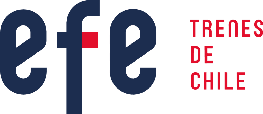
- Logo: Based on regular lines representing the railway network. A red dot acts as a unifier, symbolizing the north that guides the company.
- Typography: A clear and functional font, suitable for signage in stations and on trains.
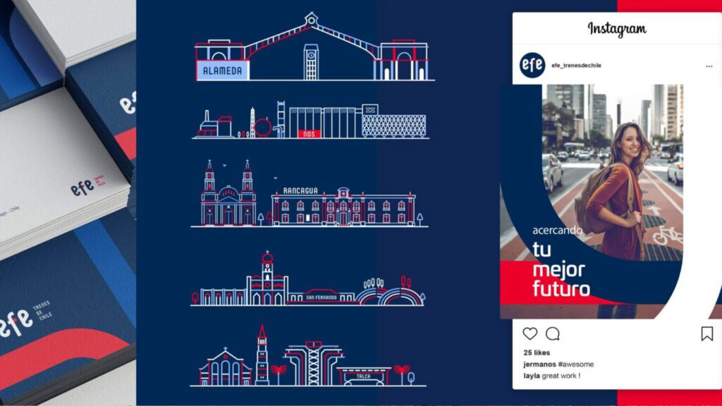
- Color Palette: Inspired by the colors of the Chilean flag, with tones adapted for a modern digital environment.
- Adaptable Graphic Elements: Designed for various media, from signage and printed material to digital platforms.
Identity Implementation
BBK Group implemented the new visual identity across all of EFE’s touchpoints:
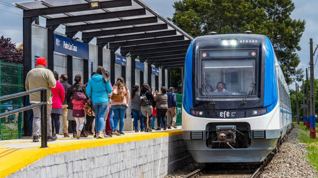
- Signage and Space Design: Renovation of stations and trains with a coherent and functional aesthetic.
- Corporate Materials: Updating uniforms, stationery, posters, and brochures.
- Digital Platforms: Redesigning the website and mobile application, optimizing the user experience.
Results
The implementation of the new visual identity brought tangible results for EFE:
Brand Unification:
Consistency in the visual identity strengthened recognition of the EFE brand across the country.
Better User Experience:
Clear signage and functional design facilitated navigation in stations and on trains.
Modern Positioning:
EFE successfully positioned itself as a reliable and modern company, aligned with user expectations and market trends.
BBK Group
The Impact of a Coherent Visual Identity.
The project between BBK Group and EFE is a clear example of how a visual identity strategy can transform brand perception and improve its market impact.
The project between BBK Group and EFE is a clear example of how a visual identity strategy can transform brand perception and improve its market impact.